This page is not created by, affiliated with, or supported by Slack Technologies, Inc.
2022-11-25
Channels
- # announcements (8)
- # babashka (58)
- # beginners (59)
- # biff (4)
- # calva (39)
- # cider (2)
- # clj-kondo (8)
- # clj-together (4)
- # cljdoc (5)
- # cljsrn (1)
- # clojure (60)
- # clojure-australia (2)
- # clojure-europe (16)
- # clojure-nl (1)
- # clojure-norway (3)
- # clojurescript (13)
- # conjure (10)
- # cursive (9)
- # datomic (5)
- # dev-tooling (1)
- # emacs (6)
- # events (1)
- # graalvm (38)
- # graphql (5)
- # joyride (1)
- # kaocha (3)
- # lsp (23)
- # malli (2)
- # mount (2)
- # off-topic (31)
- # other-languages (13)
- # pathom (3)
- # polylith (12)
- # portal (4)
- # practicalli (22)
- # re-frame (6)
- # reagent (3)
- # releases (3)
- # sql (4)
- # squint (3)
- # tools-build (10)
- # tools-deps (10)
- # xtdb (4)
I'm trying to calculate combinations. say I have a map like so
{
 :foo [1 2 nil]
 :bar [5 6 nil]
 :quax [7 8 nil]
}[[1 5 7] [1 6 7] [1 nil 7] [2 5 7] [2 6 7] [2 nil 7]]posted outside of the thread, but for completeness also here: clojure.math.combinatorics
@U013YN3T4DA How do you define the order of the keys?
I need to think about this more, thanks for the suggestions and I'll look into clojure.math.combinatorics too!
@U013YN3T4DA Are you doing advent of code? ;)
Interesting. Just used my settings for https://github.com/darkreader/darkreader to apply that to * on every page. We'll see if I notice the difference. 🙂
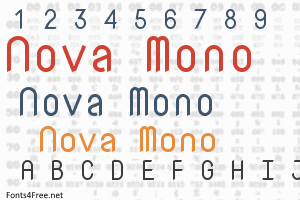
I use https://github.com/g-erson/NovaMonoLigatures across the board in Code. No need for this because everything is already monospaced. https://en.bestfonts.pro/fonts_images/5c5d5fa030732d049e02539b/nova-mono-font.png
Not outside editors, no. I said "across the board in Code". Meaning I've styled the UI of Code such that everything uses the same font, just in varying sizes.
Though I also use that font in Waybar (my system status bar), and of course in Kitty (my terminal), and I have no titlebars on any windows. So NovaMono is really is most of what I see outside the browser. 😛
I'm just such a huge fan of how rounded everything is. I find it relaxing, and easy to read in any context.
I think the designer changed the font for some reason. I just noticed all the sharp corners at the ends in the photo I linked above. And Google fonts shows the same. The ligaturized version I use is built from an old variant where everything is rounded off. Except for intersections like in "t" or "f", there are no corners to be found anywhere in the entire glyph set. 😻
FYI: I used VS Code terminology there. A code editor is a pane in VS Code where source code is shown. So that's where I use monospaced fonts, for source code. For the rest of the VS Code UI, I want a non-monospaced font.
:face_palm: Well, to me 95%, or more, of what is displayed is something that makes sense to me in monospace. The few exceptions are not important enough to be worth an exceptional font, and NovaMono is perfectly readable in those cases anyway.
I just learnt that the proper way to do this is to use:
font-variant-numeric: tabular-nums;> Whenever possible, font-variant shorthand property or an associated longhand property, font-variant-ligatures, font-variant-caps, font-variant-east-asian, font-variant-alternates, font-variant-numeric or font-variant-position should be used. This property is a low-level feature designed to handle special cases where no other way to enable or access an OpenType font feature exists. https://caniuse.com/?search=font-feature-settings
That link doesn't seem to specify any difference. Only thing I notice is there exists such a thing as a "font-variant shorthand property". So my guess now is that one is fully equivalent to the other, just named in fewer characters?
The link explicitly says to avoid font-feature-settings in favor of font-variant-numeric. Motivating it with that the former is a low level thing to use only when the more specific API does not suffice Even if they have exactly the same effect, that is enough for me to favor the latter.
I agree it is a mouthful. Almost seems like it is meant for a machine to read, rather than a human. 😃
I just learnt that the proper way to do this is to use:
font-variant-numeric: tabular-nums;